


THIS COMPANY RANGE by PURPOSE or artist's
conglomerate.
Schramowski.
Christian Immanuel
Resume
Visual Communication.

web | prepress
eXPOSÉE
-
Typo-Sol-ion's
CREA
The Spots shown here represent a variety of
Tasks i was able to solve during my Briefings as Designer in various Times
of Employment via different Agencies as well as Pri-
vate Customers.
Herein i am not only fixed
on Print or Web but had various Opportunties to
put out a Face and Look to uniquely distinguished Targets or Targetgroups such as are to be found in the Point of Interest and Point of Sales specifically.
TIVE CV
v i s u a l s.


SODA LABEL DRAFT.
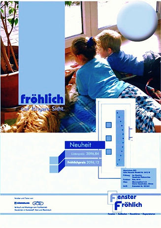
SALES
Promotion
Outlay.

Gastro-Services
Productlines.
Corporate
Design.
de~sign in Details.
Design lives
and breathes in its Details
and it's Contrasts to
the Form of it's blank
"Papersheet"
or Userface
The Context of leaving out
in favor to Add is the
original task
Most of the time it is a combination of both.
LOGO ANIMATION STILL.
Agfa Ad.
Church-Booklet.


applied in typo & typo-design. Micro~Typography.
Typo-Solutions
and its Expressions within all Media we know Today
is impossible to
bring up not regarding
it's Roots, whether intended or not.
The applied Typo
is referable to
both in historic Grounding
as well as usage or definition within Design or any Art-like Visuals of Communications. The Microtypography is
the smallest Units of Modifying Letters or Interpunctual Accessories.
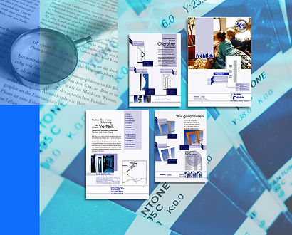
Folder Design


Catering Brand Identity
and Presentation.
Prepress. Media
platforms
Cross-Media.

The permanent increasingly challenging
Tasks in Modern Communications have redefined
a new way of adding different Ways of Platform-immanent Expressions
to a more and more
unified Construct that
will carry the Identity
both in the Way of
uniqueness as well as
Recognitions and Perception to the Usrfaces and other significant Mediasources
The FLAT-Design Concept reinforces in diversity to Classic Solutions Userfaces which are as much Userfriendly and haptic sensitive as well as sensing.

DTP-INK Cartonage.
TRAM-Sign. Hangs in this Frame and Place Since 34 Years among others in the entire City.
Done in my 1st Education


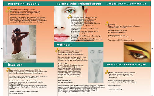
Wellness Commercial.



Bud AD and Contentside from KiCK-BOXEN.
The Magazine was issued in Germany, Austria and Suisse.

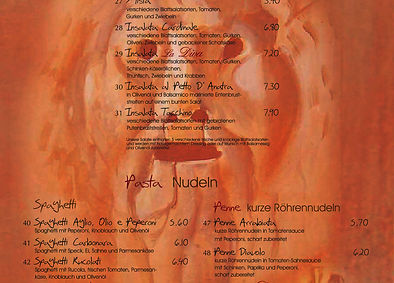



Universal Music Company
Web- and Printappearance.

PREPRESS &web.
audio-Video.
YOU CAN MESSAGE ME BY MY SOCIAL f
ACCOUNTS HERE
DIRECTLY OR USE THE FORM AT THE
HOME SECTION FOR DiRECT BRIEFING
CONTACT and Preplanning.
ALL COMMENTING
AND COMMENTERS
POSTED HERE -
will be redirected to my personal facebook
and after you will confirm it on the Checkbox
only be accessable to my Friends and me.
if you prefer a more Personal Discret Way
please use the Message Form in the
Home_Section as Indicated Below via
the Bottom Pointer.
THANK YOU.
Record Label
LOGO Developing